What are the top UX trends for websites in 2017
What is the purpose of your business website? This is one of the most important questions you need to ask when it comes to your website and, if you can’t answer it properly, you’re probably wasting your best potential sales and marketing tool.
Every website should have a specific purpose. Whether the purpose of the website is selling products, providing information, providing entertainment or branding, it must make the user feel safe and comfortable enough to complete an action, such as filling in a contact form, downloading a pdf or buying items online.
UX trends for websites change all the time and, to stay ahead of the game, you need to make sure that your website stays relevant to your specific audience. Here are a few common user experience (UX) design elements that are trending today:
Big, cinematic hero images
Users are attracted to motion, and cinemagraphs offer enough movement to grab the audience’s attention, but not too much to look overdone or detract from the website.
Stand out call-to-action (CTA) button
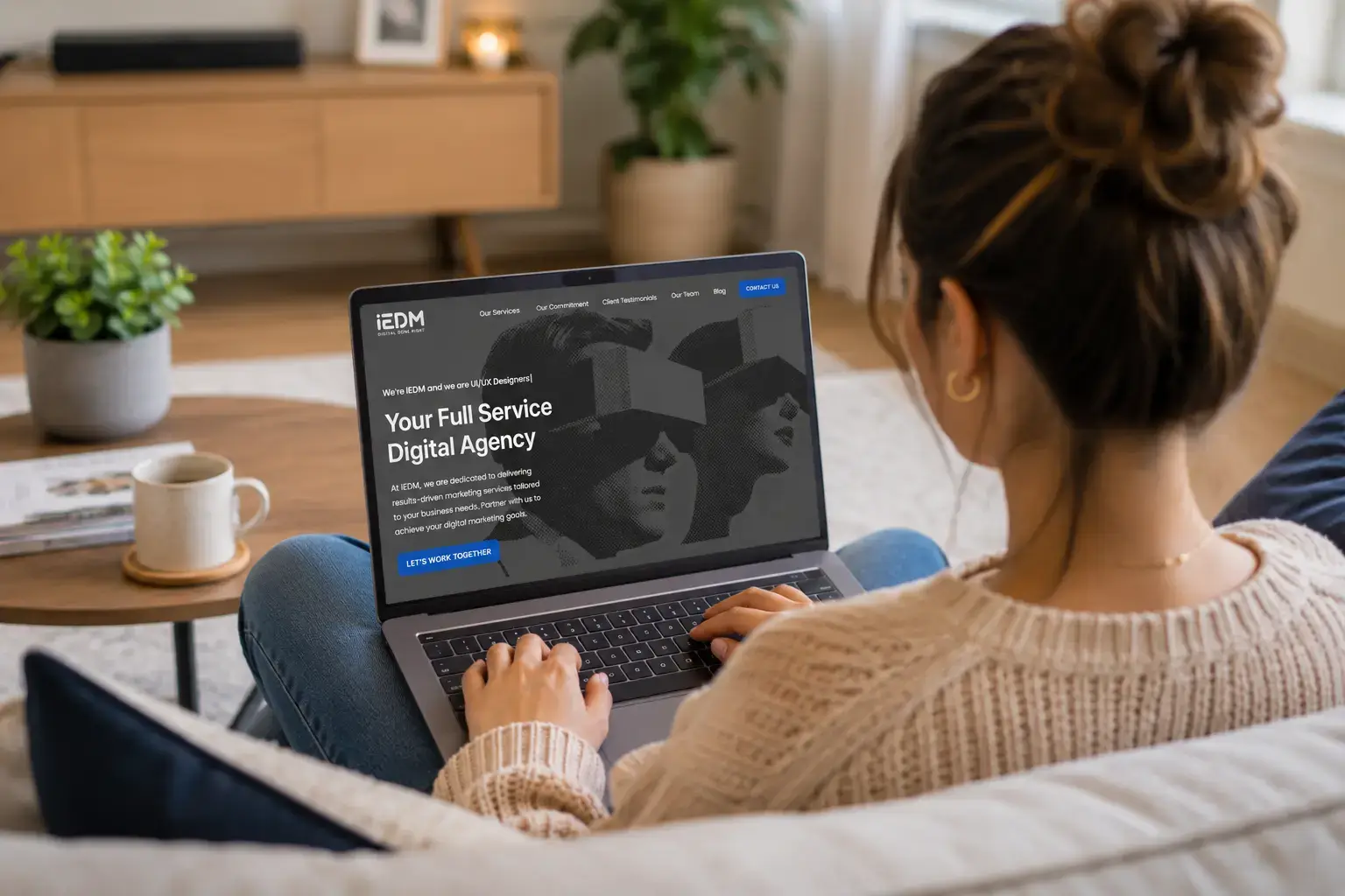
To make sure that website users convert, your CTA buttons must stand out. When designing a button, the designer and web developer need to take into account the placement on the page, size and colour of the CTA button. The button must draw attention but not distract from the other information on the page.
Skeleton screens
While a page is loading, you can show the user a skeleton screen rather than just a blank screen. The user is more likely to wait for your screen to load if you display a skeleton screen as they won’t feel as though “nothing is happening” on the page; this will lower your website bounce rate.
Offer the user something as he leaves
Have you heard of exit overlays? Well, they are triggered when a user is about to abandon your website. They come up as overlay boxes on your website with a message and help catch customers before they leave the website. The message on the exit overlay should not ask the user for anything, but rather offer them value, such as coupon codes, free trials, etc.
Live chat pop-ups on websites
Live chat is a convenient way to provide potential help and guidance to your website visitors. This added personal touch to your website can improve your conversions significantly. Customers who are helped via a live chat pop-up on a website are more likely to come back to the same site again.
Well thought out content
Creating copious amounts of content around topics does not cut it in the digital world anymore. When a website has credible, relevant and professionally written content, users are more inclined to use the website. Make sure your content follows these best practices:
- Make use of different sizes, colours and fonts for headings and subheadings so that the user knows how to differentiate the body of text from the headings.
- Don’t overfill your page with text and images. Sometimes the lack of content draws more attention to the existing content on the page.
- Remove unnecessary elements, such as animation and pointless navigation windows, so that the page is less cluttered and provides a cleaner, more deliberate experience.
Easy to navigate design
Did you know, first impressions are 94% design-related.
People are very impatient nowadays. They want to find what they’re looking for within a limited timeframe and, if they can’t, they leave the website. Make sure your website shows relevant information as well as guides the user through the website so that they don’t get frustrated and leave.
IEDM Digital Marketing can help you create a great website UX. Contact us today for more information.
Error: Contact form not found.